San Miguel, IRL
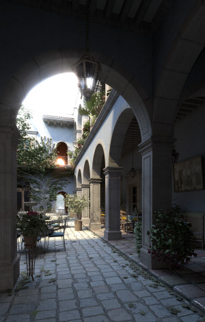
The cover image of Physically Based Rendering plays two important roles: it’s not just there for the aesthetics of a good looking book, but it also sums up the book’s proposition—if you read and study this book, you can completely understand how to write a program that generates images like this one. To that end, it’s always been a requirement that the cover image be rendered by pbrt.
For the first edition, we used the best model we could put our hands on: an ecosystem scene from the 1998 SIGGRAPH paper Realistic Modeling and Rendering of Plant Ecosystems. By 1998 standards, it was an impressive scene, and it was good enough for 2004. For the second edition, in 2010, we wanted something new and more impressive.
Lacking any better ideas, Greg and I sent a note to the pbrt mailing list announcing a contest: submit a great scene for pbrt and the best will be on the cover. From what I remember, we didn’t get many responses and the ones we did get weren’t any better than the scene we had from the first edition. We kept on working on the book’s contents without a cover image and started to worry about how that was going to turn out as the deadline got closer and closer.
Then, out of nowhere, we received an email from Guillermo M. Leal LLaguno with some renderings of what’s now known as the San Miguel model. There was a geometry-only version rendered with pbrt and a few mental ray renderings, those with proper materials and textures. Guillermo wrote:
The idea for this project came while on a trip to a small Mexican town (San Miguel de Allende). We stayed in a hacienda and I just loved the place, so when I came back I started to model it at night, but I was never able to finish it. I did some renders some time ago in mental ray but just never finished it. I believe it’s an excellent subject for pbrt.
The mental ray renderings looked great, but there was still some way to go to get it rendering in pbrt—for example, the scene was modeled in 3DS Max, but there was no 3DS Max to pbrt exporter. And, while pbrt ain’t no slouch of a renderer (if I may say so), it isn’t a commercial product, and it was certainly less mature then than it is now. It wasn’t clear whether this was actually going to work out, with two months left at that point before the cover image was due.
To my amazement, then and now, it all went remarkably well: Guillermo had infinite patience working with a buggy early version of pbrt-v2 and went ahead and wrote a 3ds Max to pbrt exporter from scratch. Two months later, he rendered the image that was used for the cover:
We released the scene description with the book and since then it has seen widespread use in computer graphics research, both in pbrt and in other renderers. I think that it remains an impressive scene to this day: a great combination of interesting architecture accented with an abundance of plants, beautifully lit with a variety of materials.
San Miguel today
It so happens that the Mrs. Pharr recently took a trip to San Miguel de Allende to meet up with her sister, who is traveling in Mexico. She had the genius idea of finding the hacienda, seeing it in person, and taking a few pictures.
Other than knowing what town it was in, I didn’t have any more information about the place—its name, its address, or any of that. A few years ago, Jacobo Ríos tweeted about visiting it, but I wasn’t able to find a way to get in touch with him now.
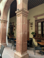
Lacking better options, I spent an hour or so with Google image search, searching for things like “San Miguel hacienda”, “San Miguel hacienda tables and arches”, and scrolling through pages of results. I still couldn’t find anything that matched the model—the grooves in the square columns were the tell I was looking for but never found. So much for Google’s fancy pants deep-neural-net-powered image search.
Fortunately, the folks at the front desk at her hotel immediately knew the place from the image in Jacobo’s tweet: Hotel Posada Carmina. It’s the restaurant there, Casa Carmina, and it’s known for its breakfast. It seems that they also sell Cuban cigars.
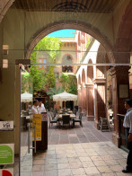
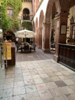
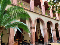
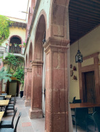
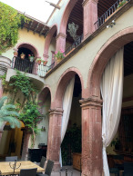
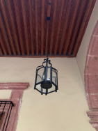
Here’s how it looks today:
I find it fascinating to see the actual place now, so familiar but yet so different, after so many hours looking at renderings of it, peeping at pixels to figure out bugs. I like the blue stucco version more than the yellow-ish tan, which I assume is thanks to Guillermo’s artistic license.
With the name of the spot in hand, I could google effectively. I found that street view absolutely delivers. And it’s not just the outside—there are 360 degree panoramas at multiple places in the interior that make up for those failed image searches and then some: entrance, interior, food view.
With the right search term, image search comes up with no end of images of the place as well. Of them, my favorites are these photos of a wedding that was held there in that familiar space.
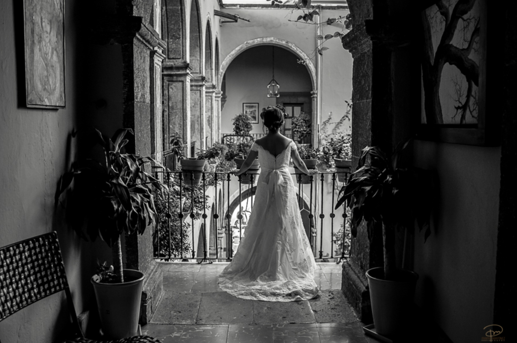 Photo from a wedding held at Casa Carmina, the inspiration for
the San Miguel model.
For how great the model is and how nice its renderings can be, it’s incredible how different it is to see the space filled with people, celebrating a day like that. It seems that we still have a ways to go.
